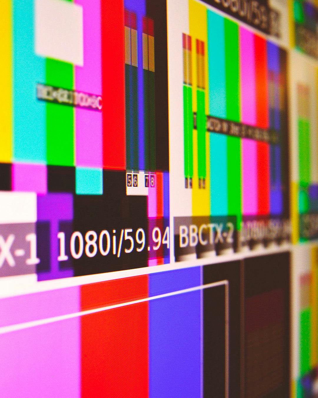
Screens and monitors, depending on their hardware characteristics and specific settings, can also represent colors very differently. This effect can be seen, for example, in electronics shops, with shelves full of televisions that transmit the same images at the same time. Or it can also be noticed when working with two screens with duplicate images.
Technology has tried over the years to perfect the representation of color on screens, making it more and more faithful to real colors. But it is still an approximation: speaking of the RGB color model (the most common encoding method in the digital domain), the color of each individual pixel is created by combining the main colors (Red, Green and Blue), assigning each of these three values a number from 0 to 255 (8 bits). While in theory this method allows for more than 16 million colors (2563=16777216), in practice screens (especially older or cheaper ones) struggle to render colors accurately, especially those at the extremes of the range.
Furthermore, the perception of color varies greatly depending on the brightness and saturation of the screen.When choosing a paint, however, we would like a reliable simulation of the color we are going to buy... So how do we get as faithful a preview as possible? Here are some tips:
Check the brightness of the screen
In general, screens return colors that may appear 'brighter', a mistake due to the light emanating from the screens. Most screens allow you to adjust the brightness: if it is too low, the color will be perceived darker, if it is too high, you will get an excessively vivid color.In general, screens return colors that may appear 'brighter', a mistake due to the light emanating from the screens. Most screens allow you to adjust the brightness: if it is too low, the color will be perceived darker, if it is too high, you will get an excessively vivid color. Therefore, try to find a middle ground with the help of a reference image, like this one:

Make sure that the background is as dark as possible, but that the word VERNICE is barely discernible.
Once this setting has been made, however, it is not always applicable in all situations: in fact, this depends on the light in your environment. You will therefore have to repeat the test in case of different lighting conditions. Many recent devices have an automatic adiustment of this parameter, which has proven to be quite reliable
Rely on calibration tools
All the latest operating systems and screens, both for computers and smartphones, provide color calibration tools for screens. Relying on these tools is a quick and effective way to set your screen. Check the settings of your device and adjust the parameters manually until you reach the optimal condition.
There are also websites and web applications for screen testing to detect brightness and contrast problems, 'burnt' pixels or various malfunctions.
Compare the same color on several screens
Comparing two different screens (especially if from two different brands) will help you have another reference for the color you choose. The absence of big differences can guarantee a certain reliability of the color representation on the screen. If, on the other hand, the two colors appear very different, you can try to compare with a third screen. However, you tend to trust more modern models with newer technologies (e.g. OLED is better than LCD), larger screens and higher quality screens.
Still not sure? Buy a 100ml bucket!
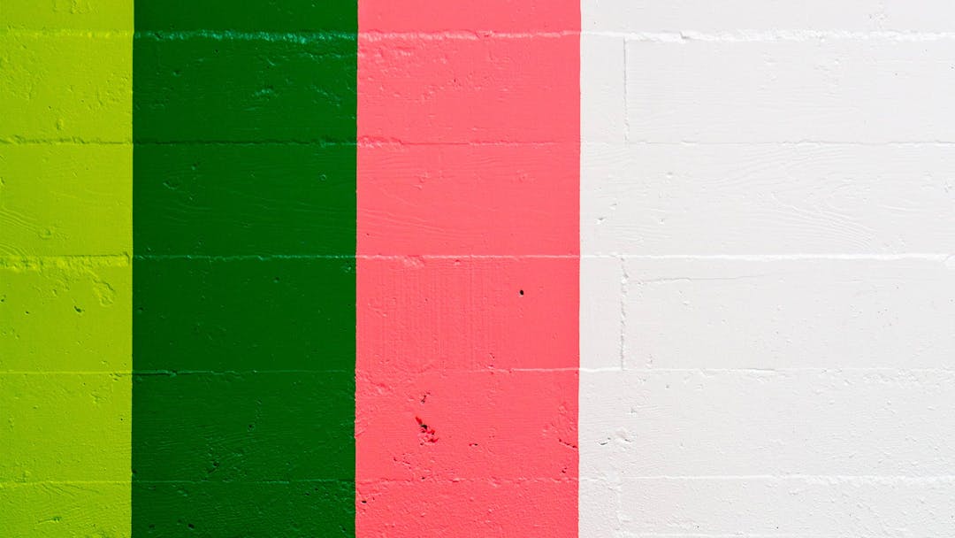
If you are still undecided about which color to buy, VERNICE gives you the opportunity to buy a 100ml bucket on request. With this quantity you will be able to try the paint on an area of approximately one square metre, and test the actual color on the wall before purchasing a larger quantity.